The Greatest Infographic Ever Created

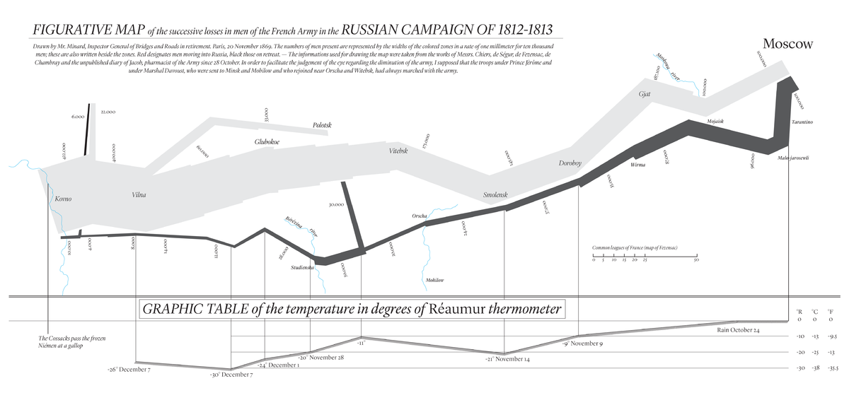
Drawn in Paris and dated November 20, 1869, Charles Joseph Minard’s Figurative Map of the Successive Losses in Men of the French Army in the Russian Campaign of 1812 is known by information scientists and data scientists as one of the greatest (if not the greatest) statistical graphic ever created. Edward Tufte calls the graphic “The best statistical graphic ever drawn” in his classic The Visual Display of Quantitative Information. Infographics have become popular ways of representing data, but Minard had the idea a century and a half ago. Mindard’s infographic depicts six data types in an easy-to-understand and elegant fashion.
The data types depicted are as follows:
- Size of army – 1 millimeter in width represents 10,000 men
- Direction of movement – light gray (gold or red in original version) depicts forward movement into Russia and black indicates retreat
- Course of movement – the course of the army’s movement, including various splitting points, is indicated by the actual movement on the map
- Temperature – indicated on the bottom
- Date – indicated on the bottom along with temperature and corresponding to the various points on the map
- Geography – actual cities and rivers are plotted as they would be on a normal map
It’s astonishing that such a quality infographic was created over a century ago. The elegance of the graphic is in it’s ability to depict so much information in a very intuitive way for the human eye. That is what good data visualization is all about: distilling information so that the important parts are easily accessible to the human mind upon examination without much effort or analysis.
One stunning thing the graph represents is the utter devastation the invasion caused the French army. Looking at the starting and ending points in the lower left, we can see that the French army was annihilated by the extremely cold and difficult journey. That human aspect is left out of the data visualization as it almost always is. It takes the human mind to put that extra human element to the graphic and to the numbers.
Download Full Image


