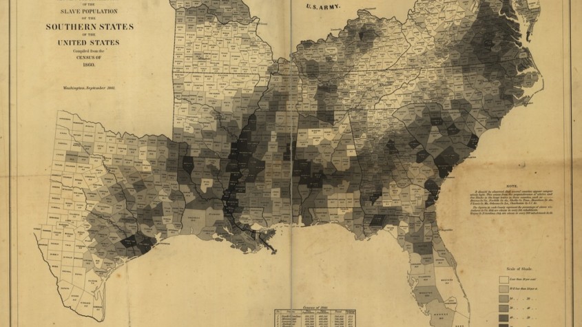
The Infographic Abraham Lincoln Used

The map, titled Map Showing the Distribution of the Slave Population of the Southern Sates of the United States Compiled from the Census of 1860 specifically focuses on the Southern States and divides each state into counties. The darker the county is shaded in, the higher the density of slaves. It might be hard to see this on the above image (so I’ve included a downloaded file of a high resolution capture of this infographic), but the darkest square on the bottom left corresponds to a slave density of 80% +. This is astonishing to me. This means that in some counties in the United States, a nation that was founded partly based on a desire for freedom, allowed such perverse things to occur within is boarders. The same nation that wrote what I would argue is the greatest document in testament to humanity’s inherent freedom and the inherent right of every individual to self-determination had, one hundred years after its founding, counties where over 80% of the residents were slaves.
Abraham Lincoln referred to this map on more than one occasion in an attempt to see how the cause of freedom and the emancipation of slaves would actually affect the troops on the ground. That makes great sense to me. If I was a general during the Civil War a map such as this might be useful to me. It doesn’t show armies or troop numbers or terrain, but it shows the sentiment of people on the ground. It shows the counties where there are few slaves (and therefore likely little resistance to emancipation) and counties where there are many slaves (and likely much resistance to the cause of emancipation).
Of course, in a county with over 90% of its population composed of slaves, would there be much resistance? I’m not sure what the answer to this is – it’s just a question that popped into my head. I would think that as the Northern Army moved down and as the North’s victory seemed more likely, counties where slaves outnumbered non-salves by a factor of almost 10 to 1 would quickly overthrow slavery in rebellion. I don’t think this occurred, however, in the history of the United States. I’m not a historian or a military expert, so this is pure conjecture.
This is just one example of amazing infographics. We think infographics are a modern phenomenon, but the above map shows that information-rich images existed a long time before the digital age.


